SYDE 2026 Cohort, Winter 2022
Leading the design of the Class Profile for our cohort
Role
Design Lead
(of a team of 6)
(of a team of 6)
Skills
UI/UX Design
Branding
Prototyping
Product Thinking
Branding
Prototyping
Product Thinking
Timeline
1 month
Tools
Figma
Adobe Illustrator
Adobe Photoshop
Adobe Illustrator
Adobe Photoshop

01 — Context
At the end of February 2022, 19 of us from our cohort got together and started a project to create a class profile for our first term of university.
What is a Class Profile?
Class Profiles are usually created by a graduating class as a recap of their university life, in forms of a slideshow or a website. The Class Profile we created, however, is solely based on our first term of university, and was created to provide some insight as to who we are, where we come from, and what we're doing in and outside of school. From academics and job statistics to other fun aspects of university life, we've put together the data we've gotten from the SYDE 2026 cohort and tried to answer some questions people like high school students or incoming SYDE students might have for us.
My role in this project
To contribute to bringing the best design to our class profile, I volunteered to be the Design Lead for this project and managed a team of 6 designers.

Meet our lovely designers!
In addition to leading the design of the class profile, I collaborated with the software team to make sure the website can look as close to our design as possible in the implementation stage.
Timeline
We were on a pretty tight schedule, asked to design a website in our spare time during co-op in less than a month, but we managed to do it - thanks to the extremely dedicated, hardworking members!
Week 1 (March 1 - 6) — Design System
Week 2 (March 7 - 13) — Information Architecture & Wireframes
Week 3 (March 14 - 20) — Hi-fi Design
Week 4 (March 21 - 27) — Hi-fi Design + Feasibility Check + Handover
02 — Establishing the Design System
To ensure the consistency of our design, we established the typography, colour scheme, logo, icons, and general feel of the project as soon as we got started.
Have you heard of 'Glassmorphism'?

Some of the Glassmorphism inspirations we gathered
While brainstorming the general theme of the class profile design, one of the designers suggested we take a stab at glassmorphism - an emerging UI trend that uses gradients, lights, and shadows to create a seemingly 3D effect on layered objects. Since a lot of us hadn't designed with this theme before, we were willing to take on a challenge and explore the design possibilities within the theme.
Finding the right typography & colours


For typography, a lot of us leaned towards Sans Serif since this typeface goes well with our theme, Glassmorphism, and has an overall very decent legibility. After exploring 20+ typeface options, we landed on Lexend and Nunito Sans for the heading and paragraph text, respectively.
For the colour scheme, we picked out 5 distinct, easily distinguishable colours to represent the diversity within our cohort and created gradients between each one to fit the Glassmorphism theme. To ensure the accessibility of our colours, we ran our 5 colours through Adobe's colour accessibility tool and checked that our colours were colour blind safe(see image below).
For the colour scheme, we picked out 5 distinct, easily distinguishable colours to represent the diversity within our cohort and created gradients between each one to fit the Glassmorphism theme. To ensure the accessibility of our colours, we ran our 5 colours through Adobe's colour accessibility tool and checked that our colours were colour blind safe(see image below).

Look at that goose in the logo
We replaced the 'D' in the word 'SYDE' with a goose silhouette, a creature we run into everyday on campus! The font used is our heading font, Lexend, and the background is a linear gradient between our five primary/secondary colours.
03 — Setting up the Information Architecture

The content of the Meme Page has been blurred out as the page is not meant to be public
After establishing the design system, we constructed the information architecture for the website so that everybody knew what pages and components to design. Our website consists of 5 main pages - Home, About, Profile, Photo Gallery, and Meme Page. As we collaboratively worked on the information architecture, we asked ourselves a few questions to stay on track such as:
Is the flow intuitive enough for users to navigate without much effort?
Is the information located in places where users expect to find it?
04 — Wireframes/Low-fidelity Design
Then, we delegated a section to each member and started creating wireframes to better visualize what the website would look like and to explore different layouts. At the same time we created wireframes, we also tried to come up with low-fidelity mockup screens to make sure the proposed layouts align with our design system. For each page, we tried to come up with as many iterations as we can and discussed every option collaboratively. Some usability considerations we applied to the designs as we identified pros and cons of each option are:
Are these pages consistent with one another in terms of design styles?
What type of interaction would be applied? Will the interaction be user-friendly enough?
Is this a technically feasible design?
How would this design look on mobile? Will it be mobile-friendly?
These questions helped us stay on track of our design goals for making the website accessible, user-friendly, and intuitive.
An Unexpected Setback

As opposed to what's outlined in our (revised) design system, our initial design theme was light mode with a background colour of white instead of the navy. As we created wireframes and lo-fi designs for the Home page, however, we realized that having the 5 primary/secondary colours against a white background with dark texts on top of them made it difficult to read the texts and create accessible designs. Besides, as some colours were darker and more saturated than the others, we had to use different text colours to go on top of them, which led to inconsistencies in the overall design. In order to make our design consistent and accessible, we switched our theme to dark mode and established a solid home page design to base other pages off of before we went ahead and designed the other pages.
05 — High-fidelity Design
After going through many iterations, I came up with a home page design all designers could agree on and the team finally began creating hi-fi designs for the other pages based on it.
Home

The Home page has five gradient circles each featuring a section of the Class Profile in an arc shape. In order to make the design look seamless, the gradients were placed in the way that makes it seem like they are connected all the way from left to right.
The reason why we settled on this design over 10+ other iterations were:
1) it falls in line with the gradient/glassmorphism theme the best
2) the gradient ring design without fill allows us to use the same font colour for the texts that go on top of the circles
We also had this very cool idea to make the circles into a carousel so that when a circle is clicked, the carousel rotates and shows the clicked circle at the centre. Unfortunately, this animation wasn't technically feasible but the idea was a part of the reason why we leaned more towards this design.
In addition, each circle has a hover state that shows a brief summary of the content of its page. The hover state was initially designed under the assumption that the carousel animation would be implemented but we kept it regardless because it gives viewers a better idea of what each page contains.
Navigation Overlay & Password Overlay

The navigation overlay is where we saw the opportunity to make it glassmorphism-themed and made some deliberate design decisions accordingly. To achieve the glass effect, we made the background translucent and added a blur + noise filter to it so that you can see through it just like glass but not so clearly. In order to ensure the page beneath the overlay doesn't impede the legibility of the navigation texts, we used a high amount of blur.
For the password overlay which users have to go through in order to access the Meme page, we used a dark background with the opacity of less than 100%. The reason why we didn't make it opaque is we wanted to ensure the visibility of system status and let the user know that the screen they see is an overlay not a separate page they've been directed to.
For the password overlay which users have to go through in order to access the Meme page, we used a dark background with the opacity of less than 100%. The reason why we didn't make it opaque is we wanted to ensure the visibility of system status and let the user know that the screen they see is an overlay not a separate page they've been directed to.
About

The About page is pretty simple - we have our introduction paragraphs going over who we are and why we made the class profile, the credits section, and links to the project Github repo and the data science report.
In the credits section, we have translucent circles which add to our glassmorphism theme and in order to maintain the light blue reflection overlay, I removed the background from everyone's profile photos and used the cropped version of the photos.
In the credits section, we have translucent circles which add to our glassmorphism theme and in order to maintain the light blue reflection overlay, I removed the background from everyone's profile photos and used the cropped version of the photos.
Profile


For profile pages, our main focus was consistency. We made sure that every page has the same typography styles and the same spacing (outlined in detail on Figma).
The buttons were another opportunity we saw to add to the glassmorphism theme - hence the gradient strokes and a reflection overlay.
The buttons were another opportunity we saw to add to the glassmorphism theme - hence the gradient strokes and a reflection overlay.
Meme Page
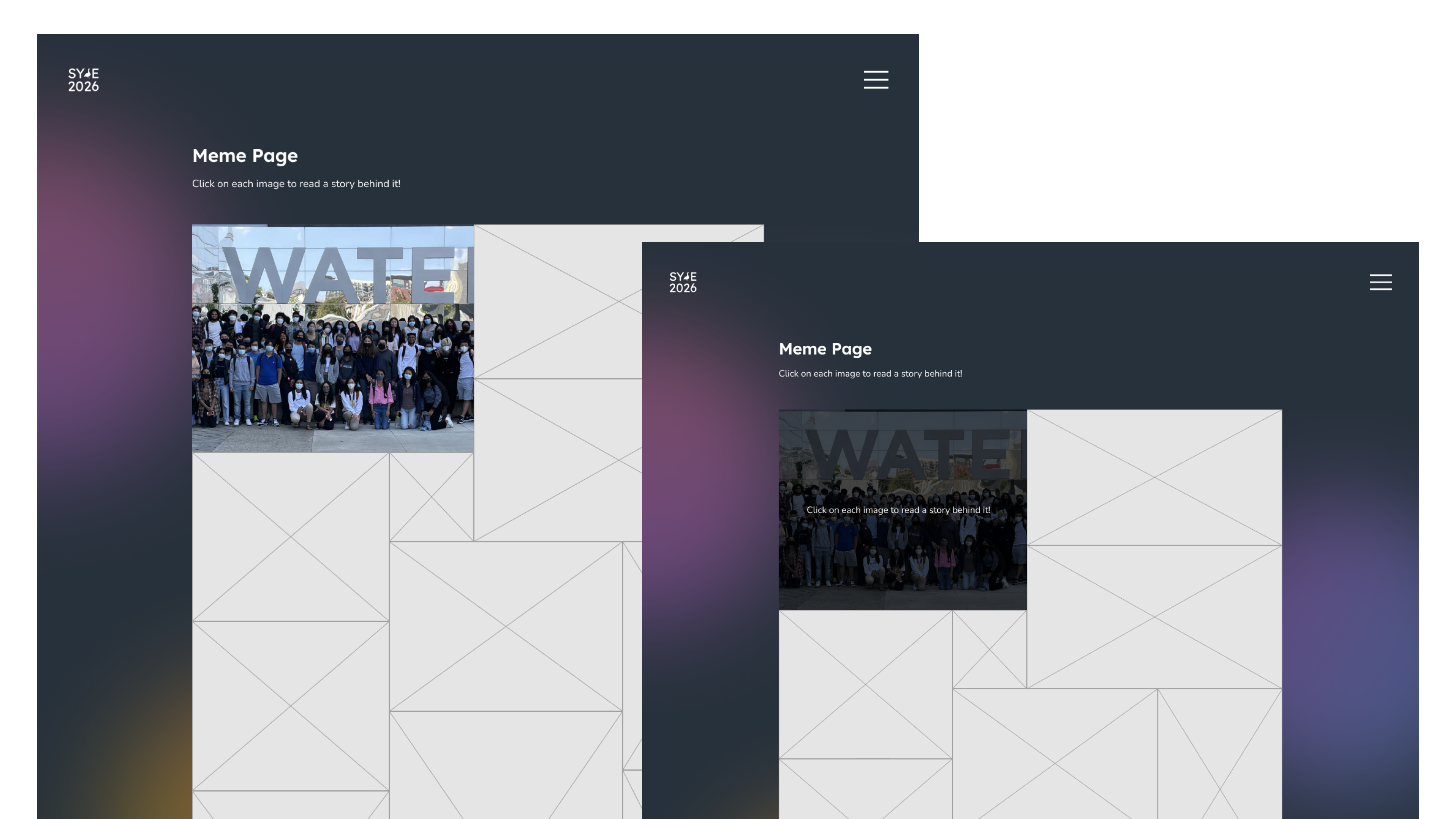
Since we were going to take submissions and use photos that are not consistent in dimensions or sizes, we decided to use one big collage of all photos stacked against one another. Each image has a hover state that shows a description related to the meme/photo. (On mobile, it's the clicked state.)
Photo Gallery

The photo gallery takes a timeline format where 4 carousels of photos are chronologically laid out down the page. The timeline graphic in the middle has the same properties applied as the profile picture components in About and the buttons in Profile - again, keeping everything in line with the glassmorphism theme.
At the top of the page, we have scroll-to buttons that allow users to get straight to the section they want without having to scroll all the way down. The buttons are especially more useful as the carousels take up over 70% of the viewport height.
At the top of the page, we have scroll-to buttons that allow users to get straight to the section they want without having to scroll all the way down. The buttons are especially more useful as the carousels take up over 70% of the viewport height.
06 — Handover to Software
The handover process involved a lot of organization on my side as the design lead, but it went pretty well for the first project handover I've taken full charge of! After completing the hi-fi design, we set up a meeting with software to go over the design together, do a feasibility check, and explain all the design specifics/constraints we had in place. In order to minimize the confusion and back-and-forths between two teams during development, I put together a document outlining all design specifics and constraints for the software team to refer to (see image below).

08 — Takeaways & Thoughts
Released for an audience of 78,000+ people, our class profile website has reached a total of 5,000 viewers with 120 daily visitors (as of May 12). I'm proud to have contributed to this project alongside some of the most brilliant minds around me.
Next Steps
As with every project, this project also has its own room for improvement.
Designing the mobile version of the screens ourselves instead of relying on the default responsiveness
Doing a more comprehensive accessibility check for every colour that's used on the profile pages
Conducting usability testings to identify any UX concerns/room for improvement
Executing the initial plan of having a carousel on the home page
Adding more micro-interactions to the elements for enhanced user experience
A lot of these opportunities for improvement could've been resolved with more time, but just with 7 weeks of time given to build an entire website from scratch in our spare time outside of work, making things work and meeting deadlines took priority. Regardless, I'm very proud of everybody on the team for staying on top of the schedule and successfully publishing the website in time.
