Electronic Arts (EA), Fall 2024
Enhancing character creation workflows with Slack
Role
UI/UX designer
Skills
User research
UI/UX Design
User testing
Prototyping
UI/UX Design
User testing
Prototyping
Timeline
4 weeks
Tools
Figma

01 — Project Overview
Task

The main task of this project was to design an internal Slack notification system to enhance character creation workflows, benefiting over 50 EA employees across 3 teams. This system sends timely alerts for user-initiated jobs in a web app, allowing users to effortlessly monitor the status of their submissions.
Team
I worked on this project while working as a UI/UX design intern on the Characters team at Electronic Arts, an internal tools team that works on game character creation products that aid in the workflows of game makers at EA. My role in this project was the lead designer, working in a small subteam alongside my design mentor, a backend developer, and a project manager.
Context

To set the stage, the Slack notification system was envisioned as an alternative to in-app notifications within a web application called HD Likeness (HDL), due to backend’s limited technical capacity and lack of infrastructure.

HDL is an EA internal tool that accelerates the character modeling phase for character artists by converting images of sports players’ heads into 3D head assets ready to be used in EA sports games.

In HDL, users can upload head images, referred to as “takes”, which are grouped into “import sessions”. These takes are then run through scans and converted to a 3D head asset.
Problem
The problem we were trying to solve was HDL’s lack of notification system to alert users when their scans were complete. This presented significant challenges to the users as:
🚨
Users were forced to manually check the app for scan statuses, disrupting their workflow and causing inefficiencies
🚨
There was no functionality to track the history of submitted scans, requiring users to remember or note down individual scans manually, which led to significant user burden and inefficiency
Solution

So to address these issues, I designed a seamless notification system that provides scan completion alerts to users via EA's internal Slack, streamlining workflows and enhancing the overall user experience.
Design Process

The design process included 6 stages: Discover, Define, Design, Validate, Iterate, and Implement.
02 — Discover: Project Goals (1/3)
Initial Project Goal
At the start of this project, I focused on understanding the goals and requirements while reviewing the existing setup. Initially, my role was scoped to simply designing the look of the notification and handing it off to the developer. To ground myself, I reviewed the Slack app already in use for test notifications and the HDL web app to explore the scan-related attributes that could inform the notification design.

Revised Project Goals
However, I noticed the test notification showed very limited information and lacked critical user insights or feedback. Recognizing this gap, I took the initiative to propose expanding the project scope to include a user survey to uncover needs, pain points, and preferences, as well as user testing to validate designs. Once my mentor and my PM approved these goals, I began an in-depth research process to create a more comprehensive and user-focused solution.

03 — Discover: Competitive Research (2/3)
Competitive Research Goals
To better understand Slack app capabilities and analyze trends in similar tools, I conducted competitive research.

Key App Functions
Our HDL Manager app had two primary functions: sending notifications triggered by task completion and connecting to web applications via APIs. I explored the Slack Marketplace and identified five comparable apps — Zapier, Trello, Asana, Jira, and GitHub.

By analyzing these apps, I uncovered common functionalities and visual components in task-driven notifications. This research informed the development of a tailored set of best practices for our app’s notification design.
04 — Discover: User Survey (3/3)
User Groups
After competitive research, I developed a detailed user survey to better understand users’ workflows and notification preferences. The survey accounted for the unique workflows of three primary user groups—FC, Madden, and Capture—who managed different parts of the 3D head asset creation process: Raw Scans and Game Resolution Head Scans.

FC handled both scan types independently, Madden ran only Game Resolution scans and relied on Capture for Raw scans, while Capture solely ran Raw scans for Madden. Understanding these distinct workflows was crucial to crafting survey questions that captured diverse user needs.
User Survey Goals
The user survey had 3 clearly defined goals:
🎯
Understand how users interacted with HDL
🎯
Understand users' broader asset creation workflows including the steps that would come after users receive scan completion updates
🎯
Pinpoint commonalities and differences across user groups to deliver a universally effective solution
Based on these goals, I came up with 16 unique questions covering users’ role, workflows, Slack notification preferences, and insights about their challenges.

User Survey Insights

Survey was a huge success, providing crucial insights about workflows and preferences of 9 different users across all 3 primary user groups.
💡
Users across all teams preferred dedicated Slack channels for HDL updates with notifications tagging relevant users for better visibility and streamlined communication
💡
Users wanted instant alerts for errored takes to enable quick resolution
💡
Users wanted detailed visibility into specific takes that were run
💡
Users requested the ability to select which statuses they see in notifications
Research Shareback
Findings were synthesized using affinity mapping where I organized identified observations, ideas, and direct quotes into 4 categories: Slack Channel & Mentions, Notification Types, Notification Content, and Customization & Control. Then, I presented these insights alongside findings from the competitive research to my team. I created a comprehensive slide deck to highlight user needs, pain points, and best practices, asking for feedback on next steps and aligning the team on priorities.

Survey response analysis FigJam
05 — Define: Feature Definition (1/2)
Based on the findings from the Discover phase, I defined key features for the notification system and created user journey maps to guide the design.
Key Features
1️⃣
Dedicated channels for each team, with notifications tagging relevant users

We wanted to have dedicated channels for each team, with notifications tagging relevant users for better visibility and streamlined communication as all users indicated in the survey.
2️⃣
Concise high-level summary with a collapsible section for detailed scanned takes

We also wanted the notification to include a concise high-level summary with a collapsible section for detailed scanned takes, as users requested for a more detailed summary of the scans.
There were a couple of key challenges in defining notification features.
🚨
Challenge #1:
Different users had varying preferences on which statuses to include in the notifications

With six possible take statuses (submitted, queued, running, complete, errored, cancelled), different users had varying preferences on which statuses to include in the notifications. So I went back to the survey results which showed "complete" and "errored" statuses as the only statuses that all users wanted to see, so these were the only statuses selected to be included for the notification.

By focusing on the "complete" and "errored" statuses, the design directly aligned with user needs and expectations. This improved the clarity and relevance of notifications, ensuring users only received the most pertinent information.

🚨
Challenge #2:
Users desired more visibility on scanned takes, but concerns arose about overwhelming users and using too much space in Slack channels

To address this, I created two versions of notifications for user testing—one with a list of scanned takes and one without, alongside a concise high-level summary.

This approach allowed me to confirm user preferences instead of relying on assumptions.
06 — Define: User Journey Maps (2/2)
Based on the survey responses, I developed detailed user journey maps for FC, Madden, and Capture teams. These maps illustrated how each group interacted with HDL from start to finish, emphasizing unique workflows and shared patterns. By mapping touchpoints, pain points, and notification opportunities, I identified when and where notifications would provide the most value. This process informed the notification system's structure, ensuring it aligned seamlessly with workflows, minimized disruptions, and addressed each group's specific needs.

07 — Design: Initial Design to 1st Iteration
The design phase saw two major iterations, focused on developing a streamlined, user-centered notification system.
Initial Design

Slack Block Kit Builder

Figma UI Kits
I started working on the initial design by leveraging Slack's Block Kit Builder and Figma UI Kits to create accurate, reusable visual components, which helped save time in future iterations. During this period, I focused on understanding Slack UI patterns and playing around with a few parameters, focusing on visual hierarchy, UI principles, and technical feasibility. This allowed me to hit the ground running once the user survey results came in.

Initial design
1st Iteration

The 1st iteration incorporated user insights and defined features from the previous phases. Most importantly, two versions of notifications were developed to confirm whether users wanted to see a list of scanned takes in the notifications. I’d like to dive deeper into some of the key design decisions I made in the 1st iteration.
1️⃣
Improved High-Level Summary

The notification’s content remained largely unchanged from the initial design, as it already aligned with the users' needs based on survey feedback. Several UI improvements were made to optimize the design however, particularly by reducing the notifications vertical length. This allows for maximum space efficiency for Slack’s limited real estate while showing only the most relevant information.
2️⃣
Addition of “Breakdown by Talent”

As previously mentioned, users wanted to see a list of scanned takes in the notification. Now the question was, what’s the best way to present this list? And how does adding the list affect the rest of the design? By analyzing the survey responses, I noticed that most users organized the scanned takes by talent, when communicating the scan results to their stakeholders. As a result, I landed on a design that reflects this workflow, with a collapsible "Breakdown by Talent" section that maximizes space efficiency.
08 — Validate: User Testing
In this Validate phase, I conducted 3 user testing sessions with different primary user groups to validate the first iteration designs.

Prototypes
Users were asked to walk through 2 Figma prototypes with different designs but same flow, which allowed for direct interaction and comparison between two prototype flows.

The flows were structured to progressively introduce complexity, ensuring a clear and focused evaluation process.
1️⃣
Screen #1: Single Notification

Starting with a single notification allowed users to concentrate on its design elements, such as content and visual hierarchy, without distractions.
2️⃣
Screen #2: Slack to HDL Web App

Including navigation steps simulated real interactions, providing insight into usability and user behavior.
3️⃣
Screen #3: Multiple Notifications

Finally, showing a realistic Slack channel with multiple notifications tested whether the design remained effective and digestible in a practical, cluttered scenario.
This approach balanced clarity and realism, ensuring actionable feedback while minimizing user confusion.
User Testing Goals

Heading into user testing, I had clear goals defined to confirm users wanted "Breakdown by Talent", validate whether users were satisfied with seeing only the "complete" and "errored" statuses, and clarify further details of user workflows.
User Testing Insights

User testing revealed critical improvements to the design, such as:
💡
Notifying by "batch", a new notification level, would be more practical than notifying by import session
💡
“Breakdown by Session” was added to clarify which import sessions were included in each batch
💡
Users preferred focusing on errored takes over completed ones
💡
Direct links to errored takes were added to streamline error resolution
Research Shareback
Findings were synthesized using affinity mapping where I organized identified observations, ideas, and direct quotes into clear categories.Then, I presented these insights to my team, again with a comprehensive slidedeck proposing next steps and asking for feedback. Especially when I introduced a new notification level, the team and I had hour-long calls exploring different options until they were eventually convinced that the new notification level was the most optimal solution.

User testing response analysis FigJam
New challenges
User testing insights presented a new set of challenges.
🚨
Challenge #1:
Determining the right notification level

Previously, notifications were designed to be sent out by import session since that was the only grouping HDL had for takes. However, user testing revealed that each user group had different approaches when submitting takes for scans, making it challenging to find a unified solution.

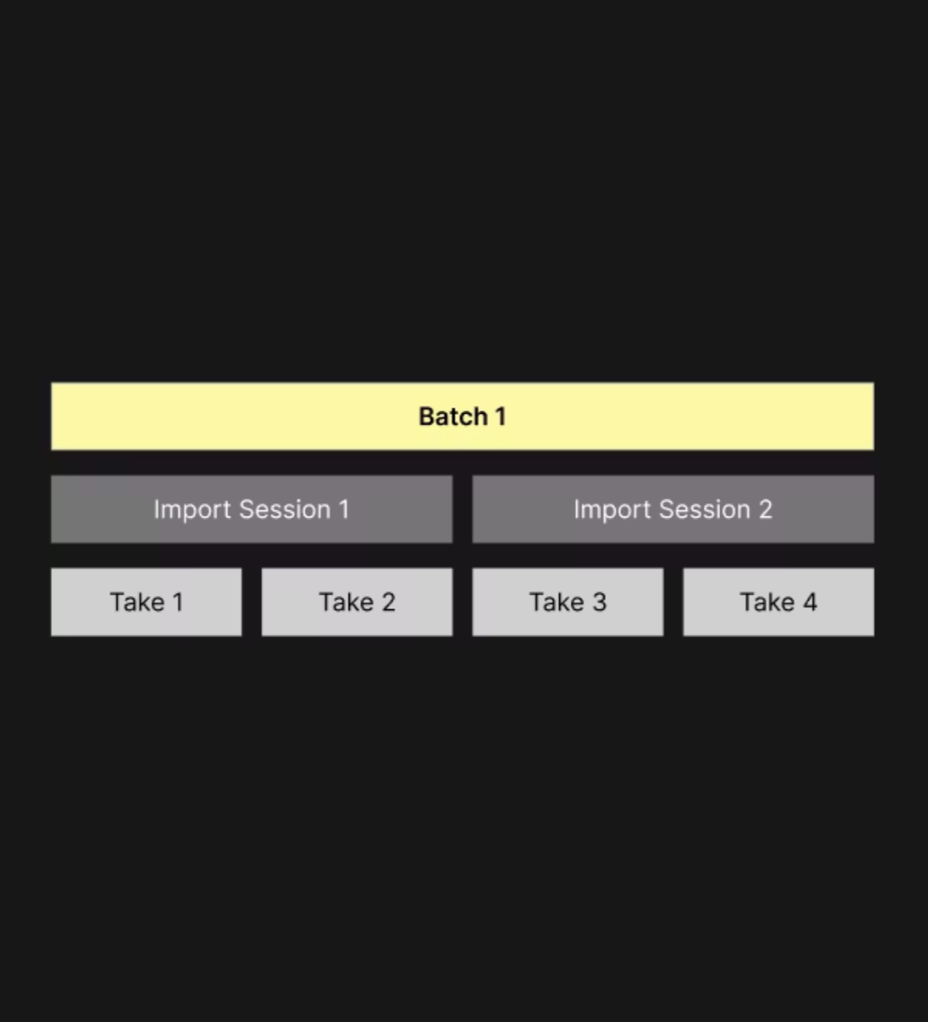
The approach I took to solve this problem was putting together a diagram of HDL inventory hierarchy and analyzing the desired notification level from each group. As a result, I introduced a new notification level, “batch”, which refers to a group of takes submitted for scans together.

Then, I realized FC and Capture effectively aligned with batch-level notifications, as a batch in Capture’s case equated to an import session. Finally, Madden's preference for notifications by take was considered impractical because users often worked with over 100 takes at a time and sending a notification for each take would overwhelm the Slack channels.

Hence, notifying by batch was adopted as the optimal, scalable solution. This ensured scalability across teams with different workflows and improved information efficiency.
🚨
Challenge #2:
Feature prioritization


Additionally, while many new ideas came up in user testing, we prioritized the most impactful, low-effort features to ensure timely delivery within the MVP scope.
09 — Iterate: 2nd Iteration
The iterate phase was focused on implementing key user testing insights into the final design, seeing 2 major design improvements.
Major Design Improvements
1️⃣
Batch-Level Summary

Switching to a batch-level summary enhanced clarity by consolidating multiple session-specific notifications into one cohesive update. This approach allowed users to quickly understand the overall status of a group of scans without being overwhelmed by fragmented updates. By focusing on batch-level reporting, the notification system aligned better with user workflows and improved the overall efficiency of information delivery.
2️⃣
Improved Detailed Breakdown

The second major design improvement revolved around the updated breakdown section, focused on delivering the most relevant and actionable information. By introducing "Breakdown by Session" and "Errored Takes by Talent," the design provided clarity on which sessions were included in each batch and linked errored takes to their respective pages in the HDL web app, allowing users to prioritize their focus and resolve issues more effectively.
10 — Implement: Final Design
After a comprehensive process of research, analysis, testing, and iterations, a data-driven, user-friendly notification system was put together, addressing distinct user needs and seamlessly integrating into user workflows. It was ready to make character artists’ workflows more efficient, more productive, and more pleasant.

Key Features
1️⃣
Dedicated Channels & User Tags

The first key feature of the notification system is dedicated channels & user tags. Every team got their own channel dedicated for HDL notifications with relevant users tagged in the messages for better visibility and streamlined communication across the team.
2️⃣
Batch-Level Notifications
The second key feature was notifying by batch. Batch-level notifications were implemented to address the distinct workflows of 3 primary user groups, balancing user needs and notification volume.
3️⃣
Notification Content Alignment with User Needs

Last but not least, the notification content was closely aligned with user needs, prioritizing critical information, optimizing space for Slack channels, and fitting into the users' established workflows by presenting information in a format familiar to them.
Implementation
Although the full implementation was not completed during my internship, I contributed by preparing the design for implementation. Using Slack's Block Kit Builder, I translated the final design into ready-to-use code for the backend developer, streamlining the development process and ensuring consistency between design and implementation.
11 — Outcomes, Next Steps, Takeaways
Wrapping up the design process, here are some of my parting thoughts on the project.
Outcomes
As for the key outcomes of the project, I successfully created a seamless, user-centered notification system that streamlined workflows, improving user efficiency. I also validated and iterated on designs based on user feedback, ensuring the system was both practical and effective.
Next Steps
I would suggest next steps for this project to be monitoring usage and collecting feedback from users post-implementation with key success metrics to evaluate the effectiveness of the design and identify pain points. Then, based on feedback, refine the system to address issues such as additional customization needs or workflow adjustments.
Takeaways
Lastly, here are some personal learning and takeaways. Taking initiative to expand the scope of a seemingly simple task, like designing notifications, led to significant improvements and value for the team by considering user workflows, technical feasibility, and potential challenges upfront. I also got to collaborate closely with the team at every point throughout the design process, including regular research sharebacks to the project manager and regular syncs with the developer, ensuring the design was aligned with goals and feasible for implementation.
I'd like to thank my mentor, Haley, our developer, Michael, and our product manager, Allyson, for all the support they've provided for me thorough out this project!
