Hack the North, Jun 2023
Making it engaging to apply to Canada's largest hackathon
Role
Product designer
Skills
UI/UX Design
Branding
Prototyping
Product Thinking
Branding
Prototyping
Product Thinking
Timeline
2 weeks
Tools
Figma
01 — Context
If you haven't heard of Hack the North,
Hack the North is Canada's largest student-led hackathon hosted at the University of Waterloo every September. We bring together over 1,000 hackers from many different countries every year. This year, over 6,000 students applied to Hack the North through the application portal that's going to be discussed in this article :)
My role in this project
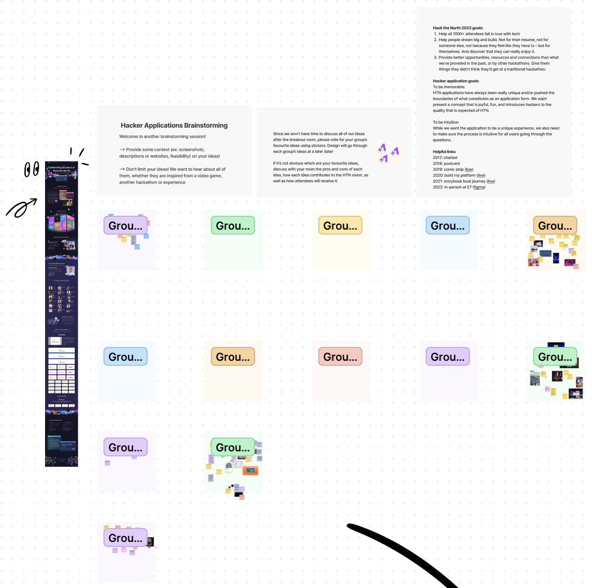
I joined the organizing team for Hack the North earlier this year as one of the 2 product designers on the team. The hacker application portal was my solo project, and I was spearheading every stage of the design process from ideation to design, prototyping, and hand-off. However, that doesn't mean this project didn't receive any input from the rest of the design team or the wider team at Hack the North. When we were kicking off the project, we got together everyone on the organizing team to brainstorm concepts for this year's hacker application portal.
02 — Brainstorming away on FigJam
With the entire organizing team on the deck, we brainstormed concepts in FigJam and started thinking about what could be the central theme for this year's application portal. For context, the theme for each year's application portal is heavily influenced by that year's website theme. The theme for our website this year was a combination of bright neon colours and pixel art which are meant to create a sense of a digitized world - as if you were inside a computer.

The statistics section of this year's website that I designed!

The Hack the North history section of this year's website that I designed!
So, we decided to take this theme a bit further and elaborate on it. What do bright neon colours, pixel art, and a digitized world remind you of?

After looking through the sticky notes on the FigJam, I noticed 4 major elements/themes that the organizers were discussing. The organizers wanted to see us incorporate...
Pixel art games like Super Mario World, Geometry Dash
Tokyo street sign vibes! (Think Dotonbori, Osaka)
Old Windows UI
Build your own billboard (with the neon signs on the website)
Gauging the timeline and the technical feasibility of every idea, I slowly started to put together the very first iteration of the application portal.
03 — Narrowing down ideas

My messy playground
I took the 4 most popular ideas into my playground and started taking them apart into smaller ideas. Take the game idea for example, we obviously can't turn the application into a game since there is a specific application flow to follow. Then, what are the elements of a game that we could incorporate into the portal? In a lot of the games, there is a linear sequence to follow, completing one stage and moving onto the next. In our application flow, you will observe a similar sequence where you first have to give us your basic information, and then you move onto the long answer section, and onto the survey, and so on. I imagined each section of the application to be "a stage" in a game and started expanding on the gamification idea.
In addition, I thought it would be fun to have different characters in this "game" hackers could choose from - just adding another layer of engagement and personalization - like this:
In addition, I thought it would be fun to have different characters in this "game" hackers could choose from - just adding another layer of engagement and personalization - like this:
That's right, our beloved mascot of the University of Waterloo - duck duck goose.
And now was the time to consider whether or not we wanted the application itself to be a game or if we only wanted a part of it to be a game. Because we still wanted to tie in this year's theme of a digitized world into the portal, I suggested having a desktop be where you start the application and having different sections of the application be windows/tabs on a desktop. Hence, the flow I imagined was:
Log in to desktop -> Open first tab (Section #1) -> Fill out Section #1-> Open second tab (Section #2) -> and so on
From there, I thought about how we could go about bringing elements of this year's theme into the portal. There were 2 main elements to consider: neon signs and pixel art.

After exploring some visuals related to these elements, I realized that they could be incorporated into a lot of different parts of the application that would make sense visually as well as fit into the application flow, like this:

Our basic information section features 2 windows - one for form fields and another one for dynamically changing illustrations
Our outro screen features a pixelated digital world combined with neon signs and personalized billboards
Kudos to our amazing graphic designers, Phoung and Ingrid, for their pixel-perfect artwork!
04 — Establishing the user flow
Initial User Flow
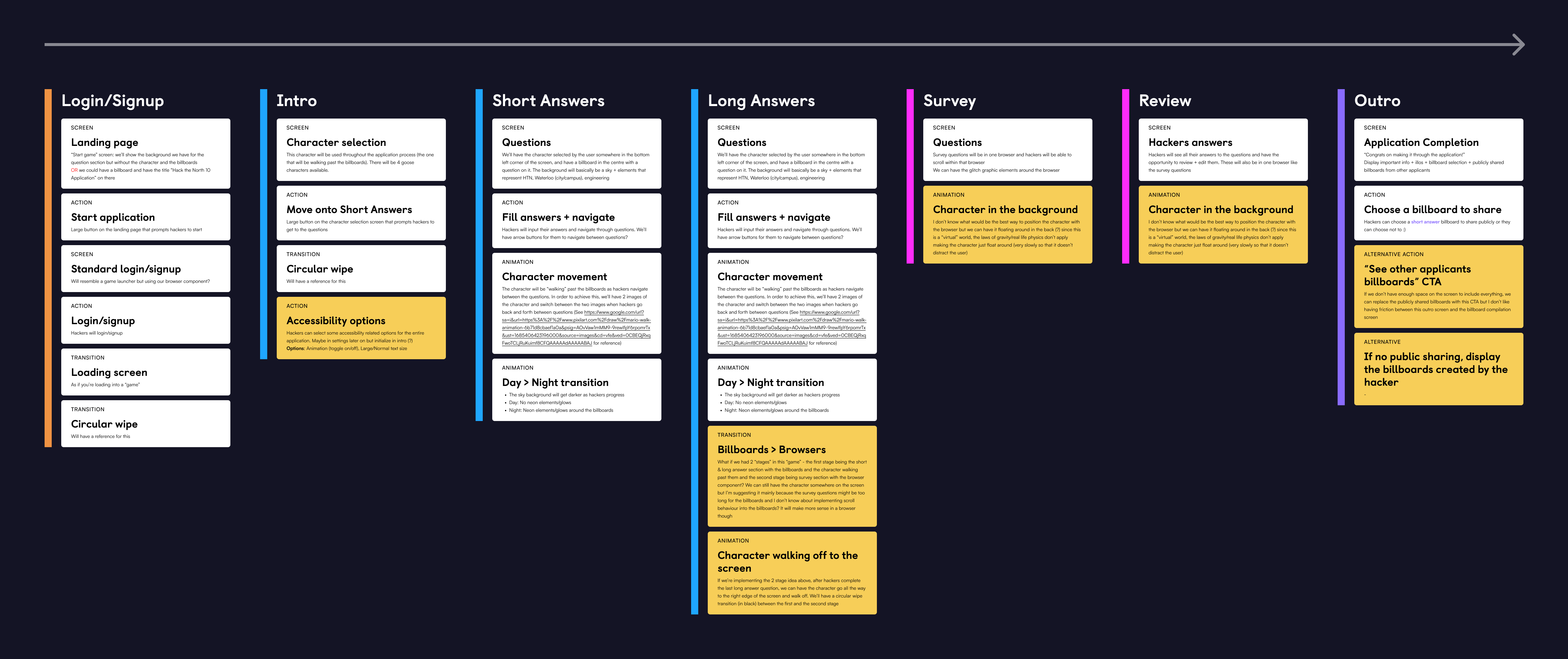
Each section is colour-coded based on the visual elements the same coloured sections would be sharing
Once we had a good general idea of what the visuals were going to look like, we moved onto establishing the user flow. Initially, we had some ambitious ideas in terms of transitions and animations. After consulting frontend, however, we decided to simplify some of the animation ideas we had that weren't technically feasible or would take too long to implement given the timeline of the project.
Revised User Flow

After presenting the first few wireframes based on the initial user flow, we decided to use browser windows for all sections instead of having the short answer section be a game application in order to minimize the confusion on the flow as well as a site behaviour (horizontal vs. vertical - further explained in the next section).
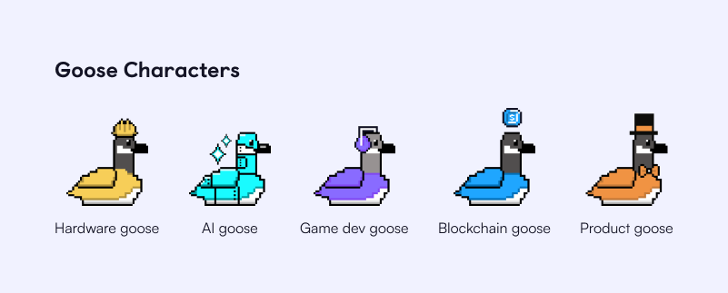
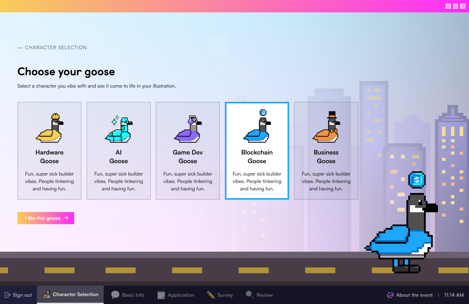
One thing I did not want to give up on was personalization, however. In the end, we decided to keep the character selection part where hackers can select a goose character which would be shown in the short answer section and the outro.
05 — Creating wireframes and iterating... a lot.
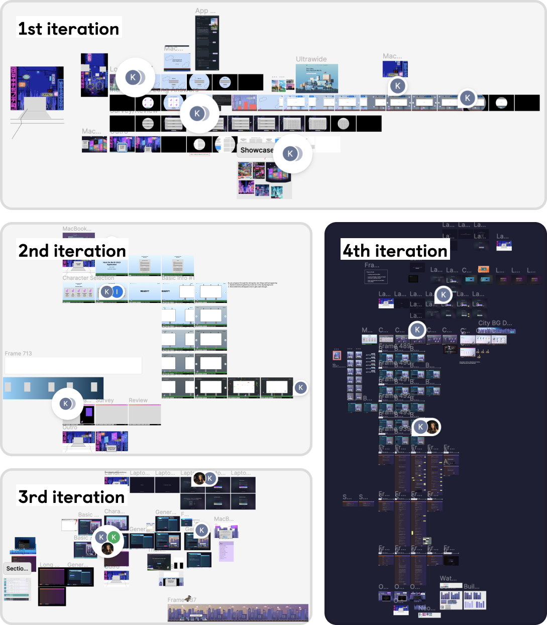
This is probably what every product designer's Figma files look like, but this project went through some heavy iterations over 2 weeks.
1st Iteration
• Very loose wireframes
• Too many animations
• Technically challenging and counter-intuitive concepts such as a horizontal billboard carousel
• Billboard sharing feature upon submission
• Too many animations
• Technically challenging and counter-intuitive concepts such as a horizontal billboard carousel
• Billboard sharing feature upon submission
->
2nd Iteration
• Very loose wireframes
• Simplified animations
• Billboard sharing feature upon submission
• Simplified animations
• Billboard sharing feature upon submission
Going from 1st to 2nd iteration, we had to cut down on a lot of the nice-to-have animations due to a tight project timeline. In this process, an idea like "a goose character floating around in the background" was cut.
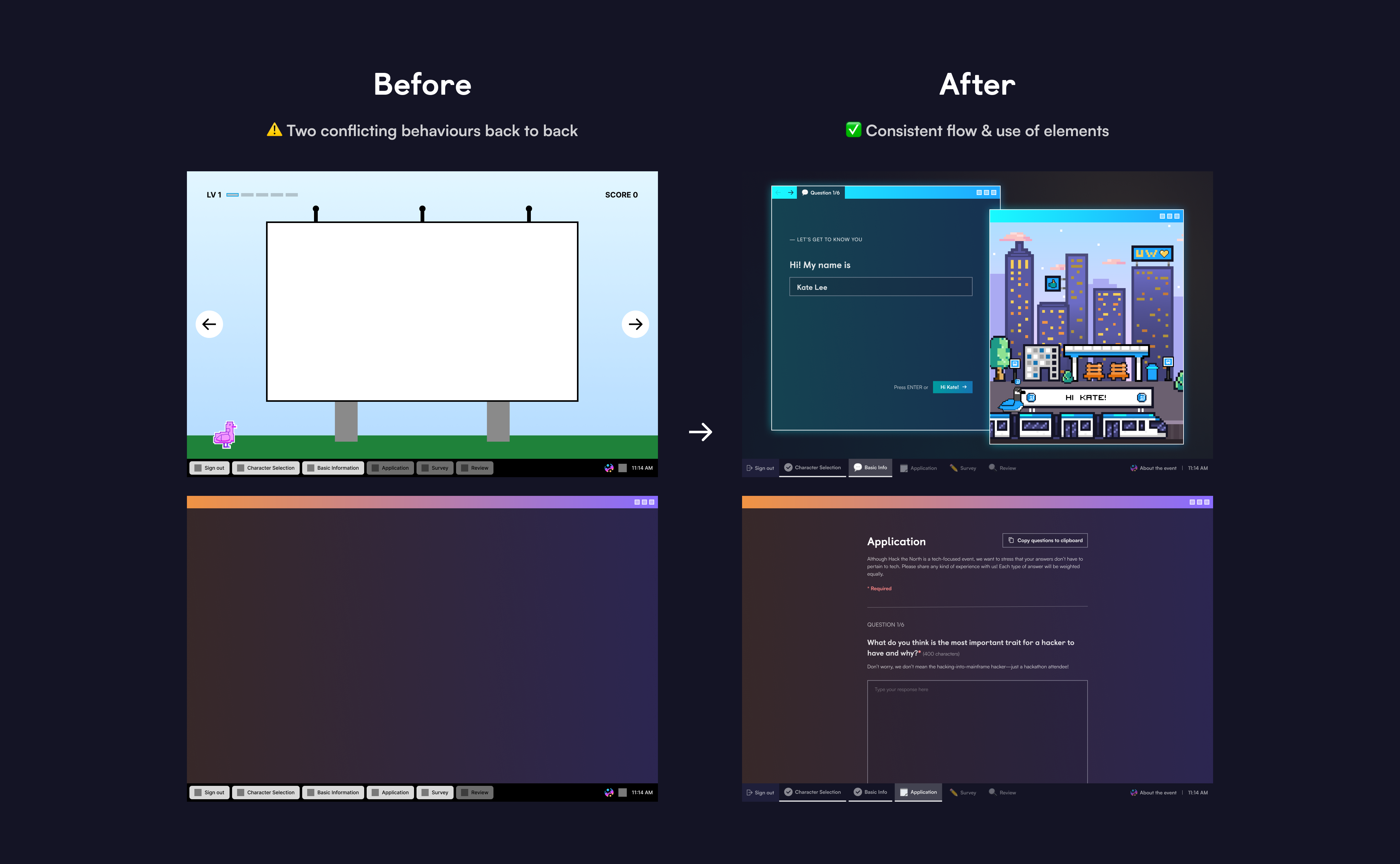
Another big shift in the direction of the project was to get rid of the horizontal billboard carousel. The horizontal billboard carousel idea was where users would fill out form fields presented on billboards, navigating left to right using arrow buttons while their character would be "walking" in a corner of the screen. After putting some thought into this idea and consulting frontend, I concluded that this horizontal flow conflicts with the vertical flow that comes afterwards, creating an inconsistent user experience. Besides, we weren't sure if hackers would understand the flow of going from a game application where they're presented with billboards with form fields to a desktop environment with browser windows with form fields. To minimize any confusing behaviour of the site, we decided to get rid of the horizontal billboard carousel and have a consistent desktop environment with browser windows throughout the application.
2nd Iteration
• Very loose wireframes
• Simplified animations
• Billboard sharing feature upon submission
• Simplified animations
• Billboard sharing feature upon submission
->
3rd Iteration
• Mid-fidelity designs
• Simplified animations
• Browser window based designs
• Honing in on the desktop theme
• Simplified animations
• Browser window based designs
• Honing in on the desktop theme
Going from 2nd to 3rd iteration, we revisited the billboard sharing feature and contemplated whether it was a worthwhile feature to have. The billboard sharing feature was an option for hackers to publicly share billboard(s) generated with their short answer responses upon submitting their application. While letting hackers share billboards with a piece of their information on it would help instil a stronger sense of community amongst the hackers, we knew it would be a technically challenging assignment for both frontend and backend, especially under a tight time constraint. We had to find a compromise. Hence, I presented the 3 following options:
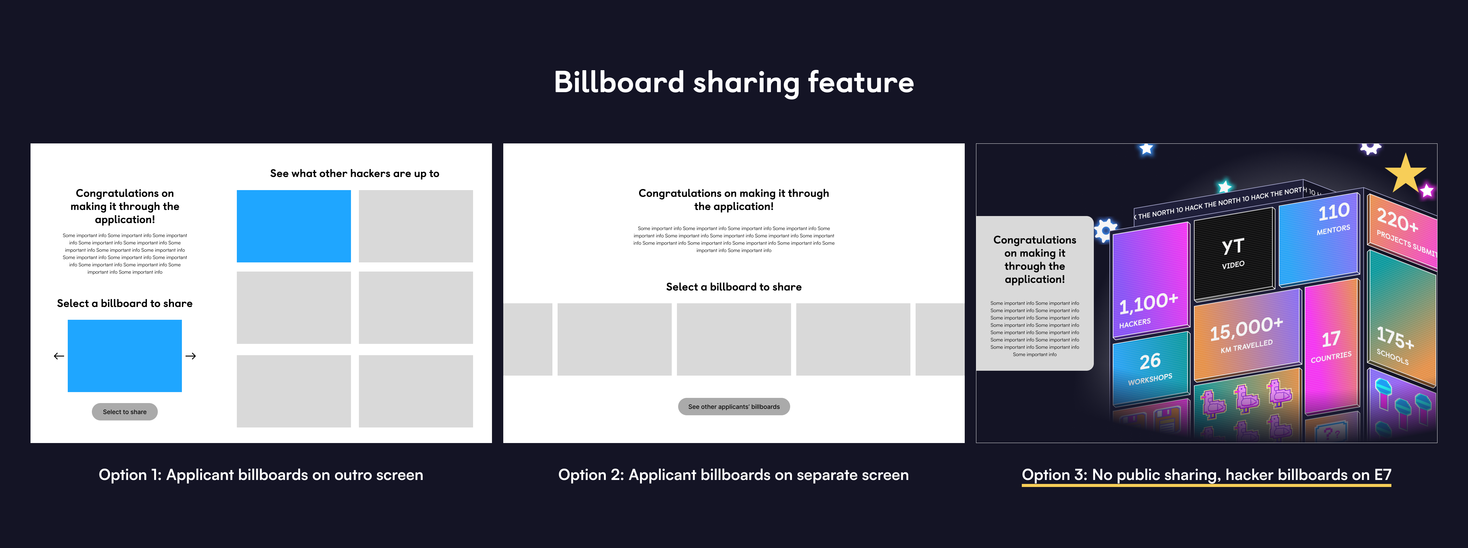
Since both Option 1 and Option 2 were going to involve heavy frontend and backend work, we decided on Option 3 to show a couple of billboards with hackers' custom responses in the outro screen upon submission.
3rd Iteration
• Mid-fidelity designs
• Simplified animations
• Browser window based designs
• Honing in on the desktop theme
• Simplified animations
• Browser window based designs
• Honing in on the desktop theme
->
4th Iteration
• High-fidelity designs
• Simplified animations
• Browser window based designs
• Setting out the desktop flow from log-in to starting application to log-out
• Simplified animations
• Browser window based designs
• Setting out the desktop flow from log-in to starting application to log-out
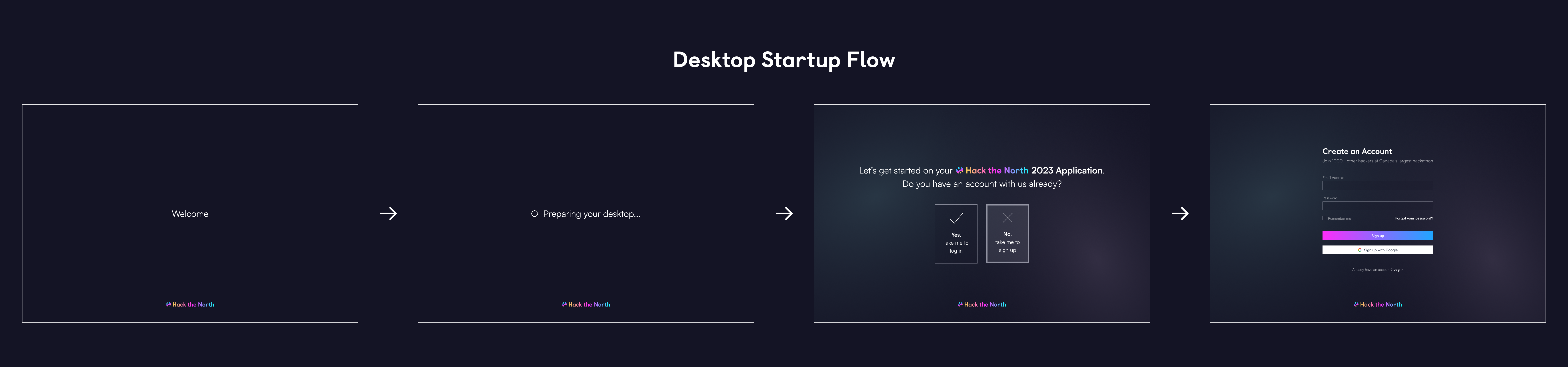
Going from 3rd to 4th iteration, we really tried to hone in on the desktop theme and made sure the flow felt as natural and close to the actual desktop experience as possible. My starting point to achieve that was to have a desktop startup screen so that it feels like hackers are logging into a computer at the start of their application:
Then, we explored different designs for possible browser window arrangements within the desktop:
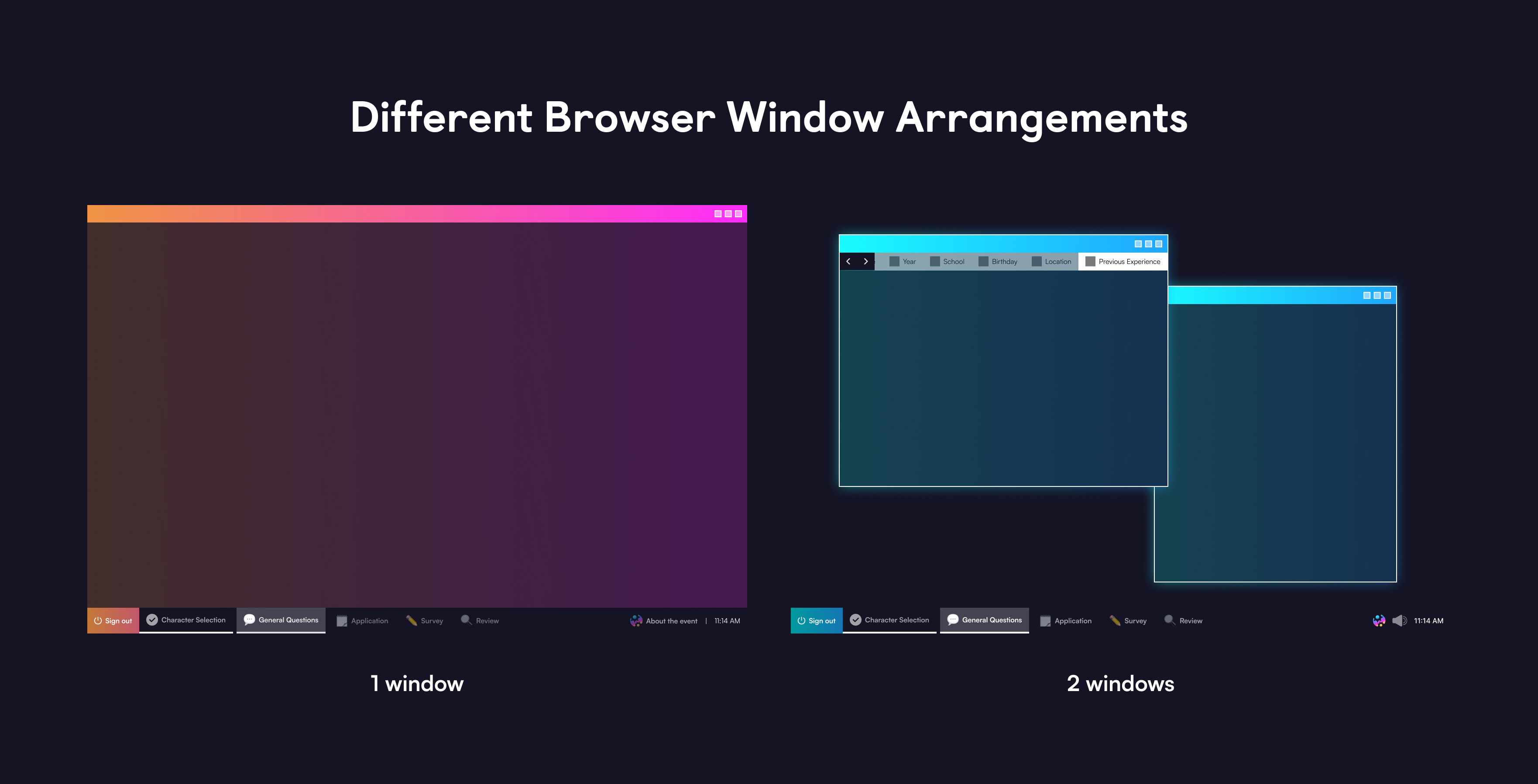
The design here isn't final as it is taken from the 3rd iteration document
And finally, the task bar design:
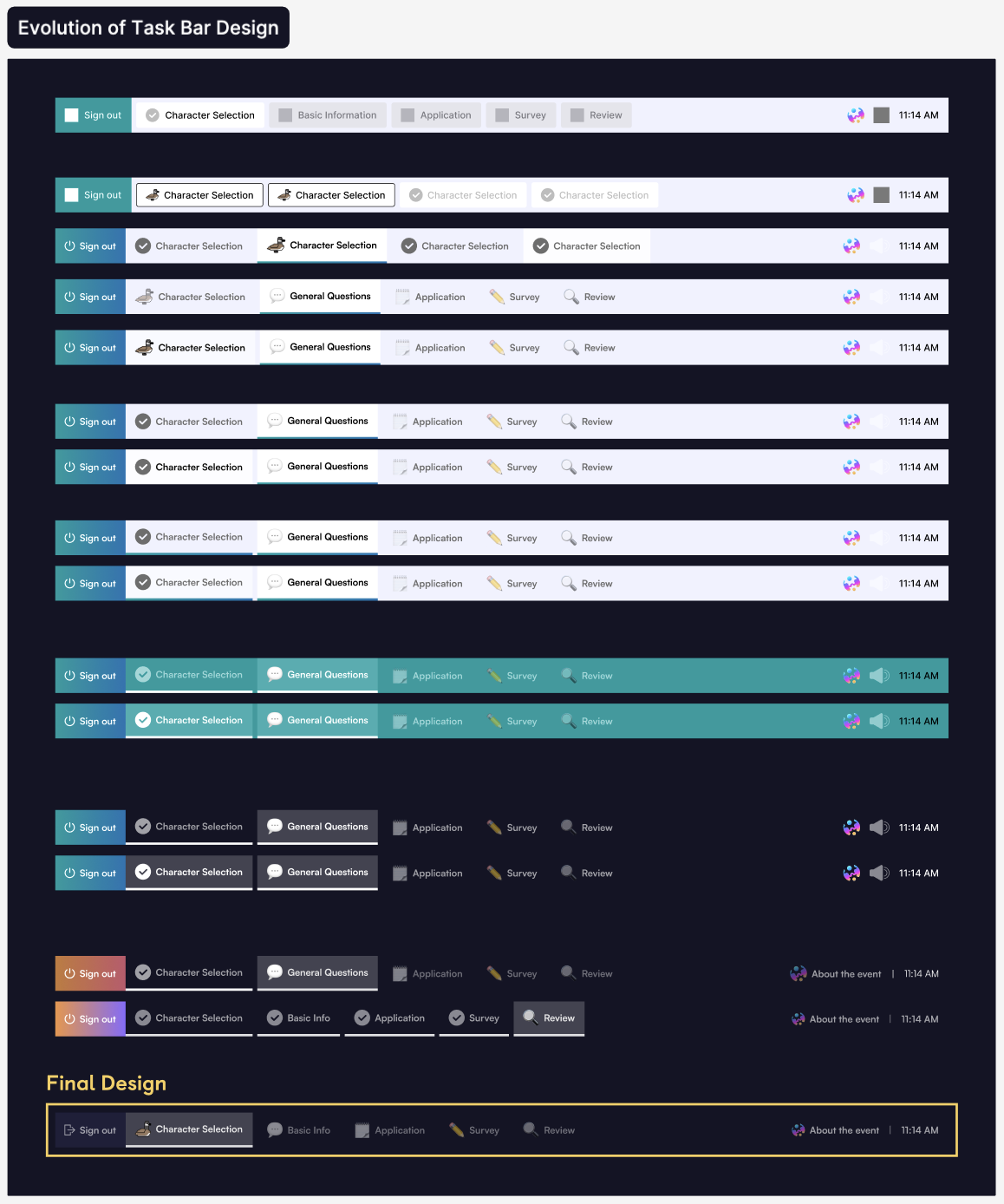
With all the components put together, we were able to create a seamless desktop experience that didn't deviate too much from an actual desktop environment, but still uniquely themed with our own visuals.
During this stage is when we also explored various ways to go about adding some fun elements and personalization.
Loading Screen & Character Selection
While reviewing the flow we had in the 4th iteration, we noticed that there was a bit of a jump going from authorization to the next section (character selection).
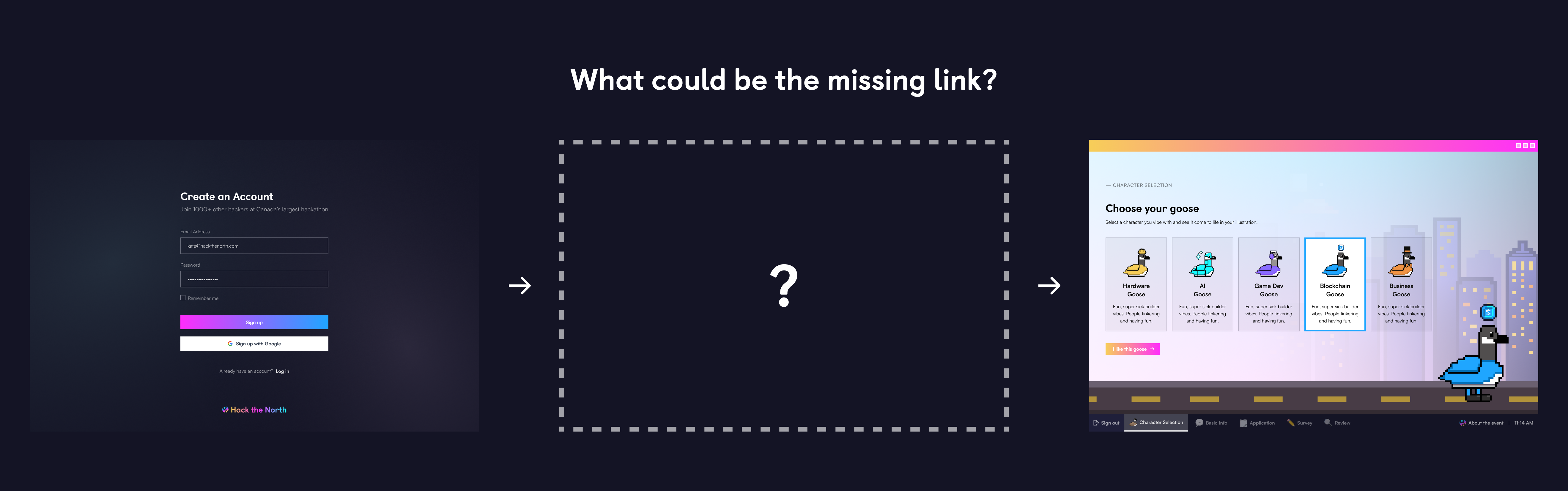
After talking with the design team, we concluded that the jump was due to the authorization screens not pointing too clearly to the desktop theme. We needed to ensure that users knew they were starting off in a desktop environment from the authorization stage, so that when they move onto the next section, all the desktop UIs they encounter don't come across as random or odd.
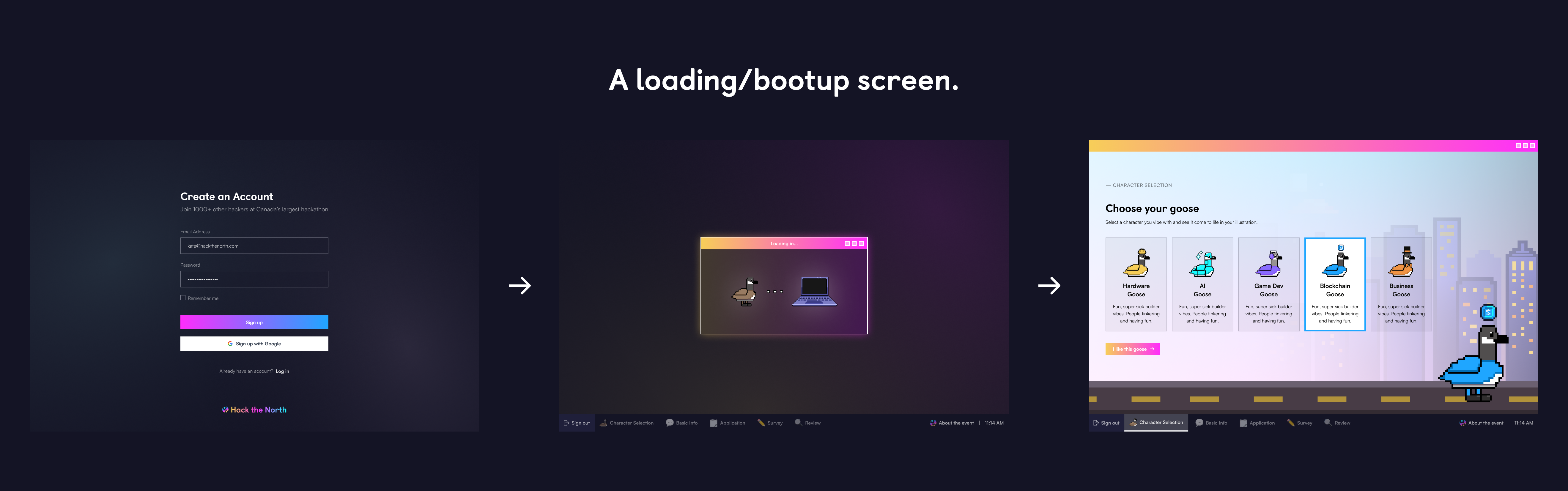

And... we found the missing link! We added a short desktop bootup flow to bridge the gap between the authorization screen that has a rather generic design and the character screen with all the desktop UIs. This bootup flow shows a little browser window in the middle with a goose walking animation and a computer illustration, to give users an impression that they're booting up their computer/connecting to the server. Now, it was more clear to users that they have entered and are working in a desktop environment.
The character selection screen is where the personalization begins as applicants get to choose a goose character, which shapes some of the later parts of the application such as the short answer section and the outro screen.

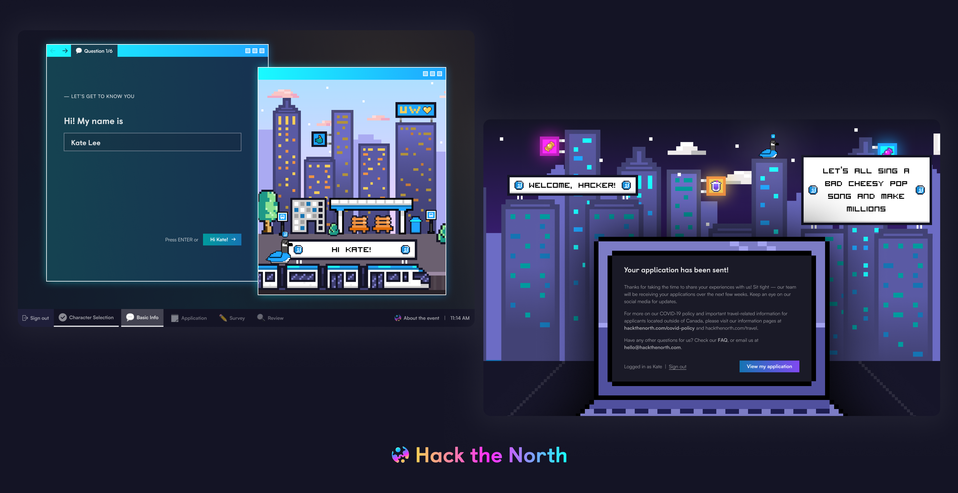
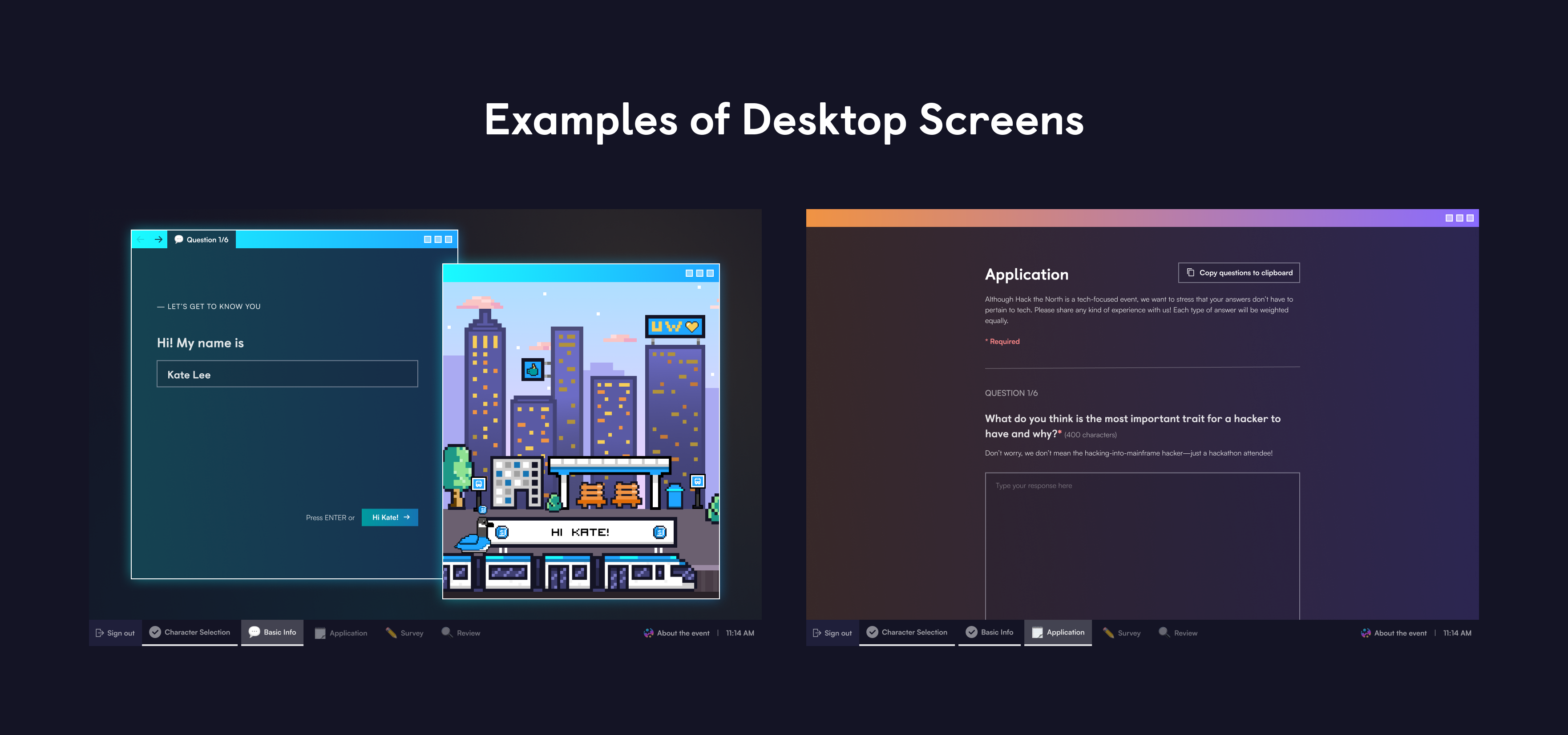
Short Answer Section (Basic Information)
This section is where applicants see the direct impact of the choice they just made in the character selection stage.
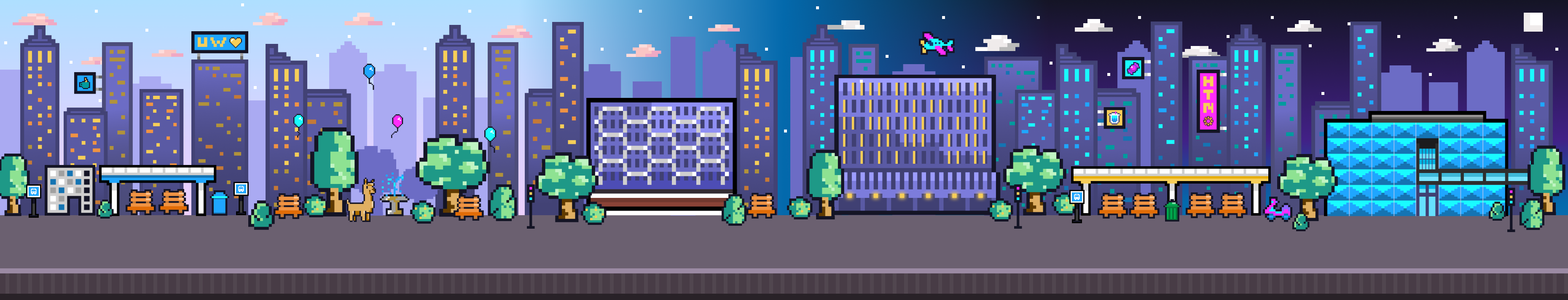
The short answer section features 2 browser windows - one for form fields and another one for a dynamically generating illustration. In the illustration window, you can see that the goose character as well as its icon have been painted onto the illustration. In addition, as you fill out the form fields, the billboard on top of the train in the illustration window gets populated with a custom text such as "Hi Kate!".
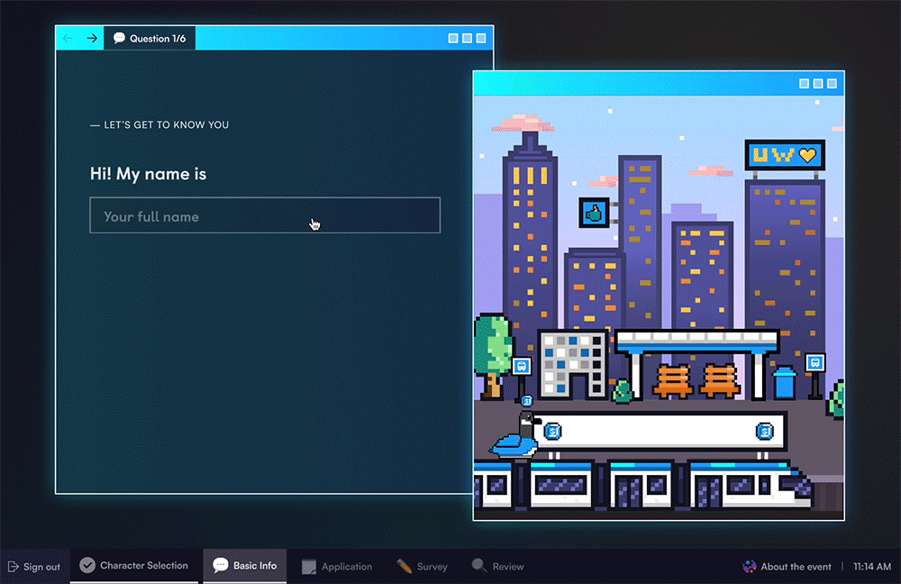
This isn't where the fun part ends. Inside the illustration browser, we have a strip of a city background that moves right to left as applicants navigate between the 6 short answer questions.
Our graphic designers are so talented, I know
In the illustration, we have a few notable establishments around the University of Waterloo and the city of Wateloo, such as the Engineering 7 (E7) building, the Waterloo park, and the bus platform hackers will be arriving at for our in-person event. The idea is to make applicants feel like they are exploring Waterloo without actually being there. Kudos to our graphic designers for allowing us to create such an immersive experience with the city background strip!
The video on the right shows what the illustration browser would look like as you go through all 6 questions in this section. Look at that train go!
The video on the right shows what the illustration browser would look like as you go through all 6 questions in this section. Look at that train go!
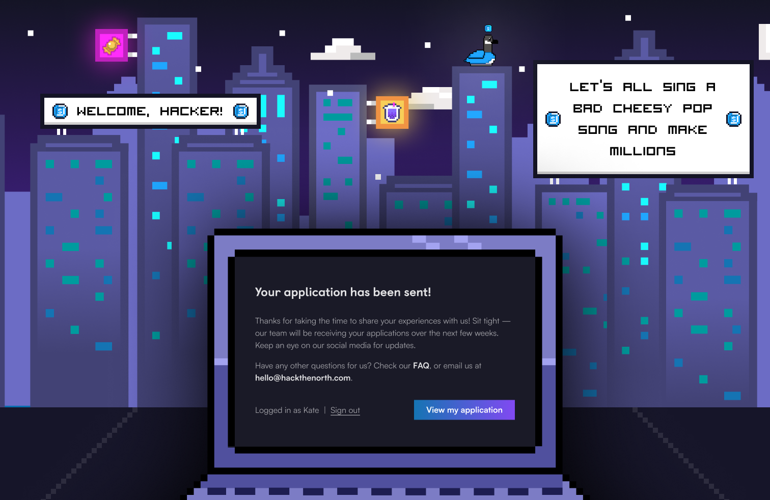
Outro
Going back to the idea of billboard sharing that was mentioned earlier in this article, the option we concluded on was to show a couple of billboards with custom texts upon submission. After talking to the application question squad on our team, we found out that they wanted to include a haiku question in this year's application.
A haiku is an unrhymed poem arranged in three lines of 5, 7, and 5 syllables
Hence, we thought it would add to the personalization if hackers got to see the haiku they came up with in the long answer section of the application on the outro screen.
Here, you can see 3 elements that are generated based on the applicant's input - the goose character, the icon that corresponds to the selected goose character, and the haiku on the right billboard. You know that this is your application, one and only. No applicant would have the same outro screen, which is what makes a Hack the North application special and personal.
06 — Final Look
Let's go through the application flow together.
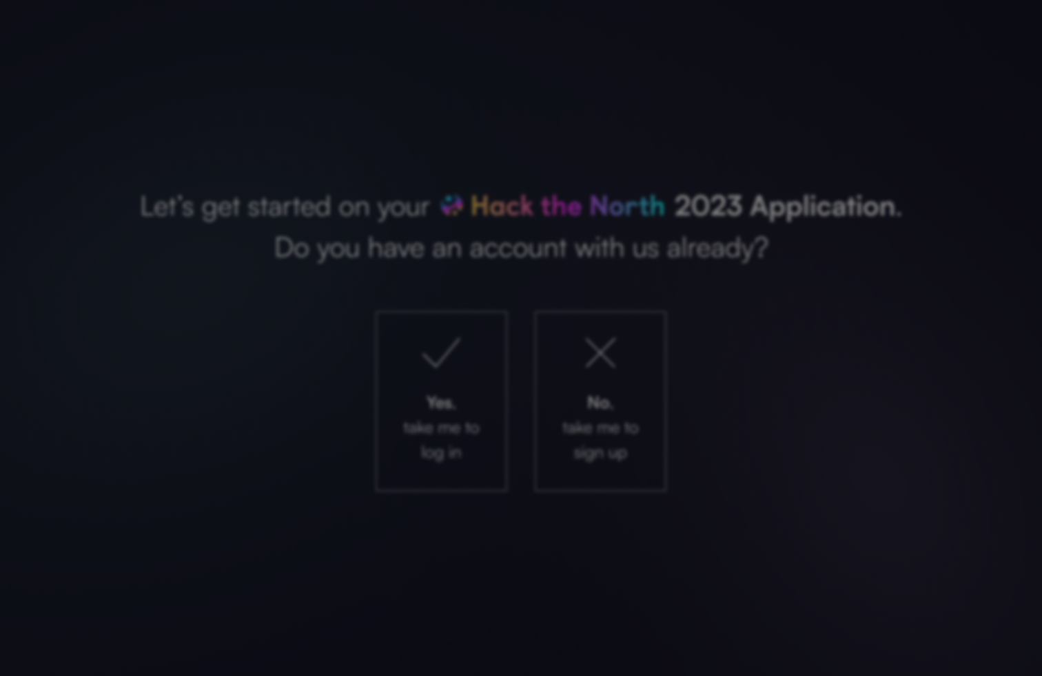
Splash & Authorization
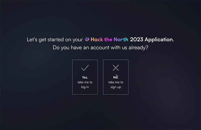
First, you answer whether you have an account with us. Then, either log in or sign up.
Loading Screen & Character Selection

Once you click log in or sign up, you will see a loading screen and then a character selection screen where you can choose one out of the 5 geese.
Short Answers (Basic Information)

Once you've selected your goose, you start filling out the short answer questions. You can see in the illustration browser that the background strip is moving as if the train is moving along the track!
Long Answers (Application)

After short answers, you will fill out some long answer questions...
Survey

and some survey questions (optional)...
Review
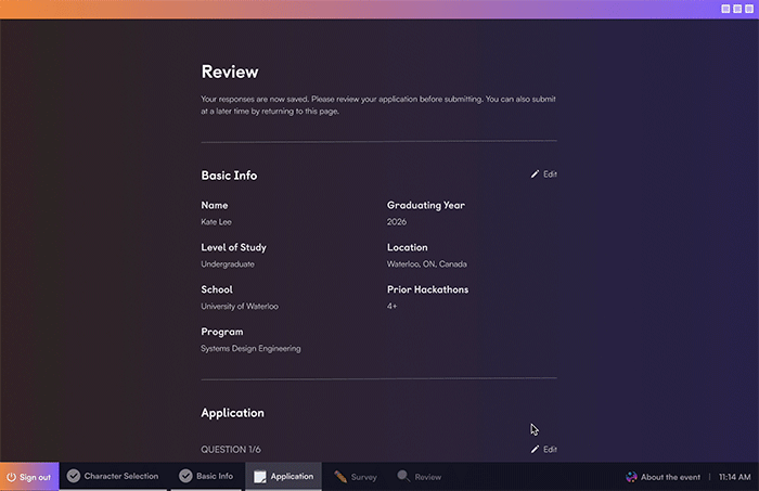
and once you're ready to submit, hit that button and head to the outro screen!
Outro
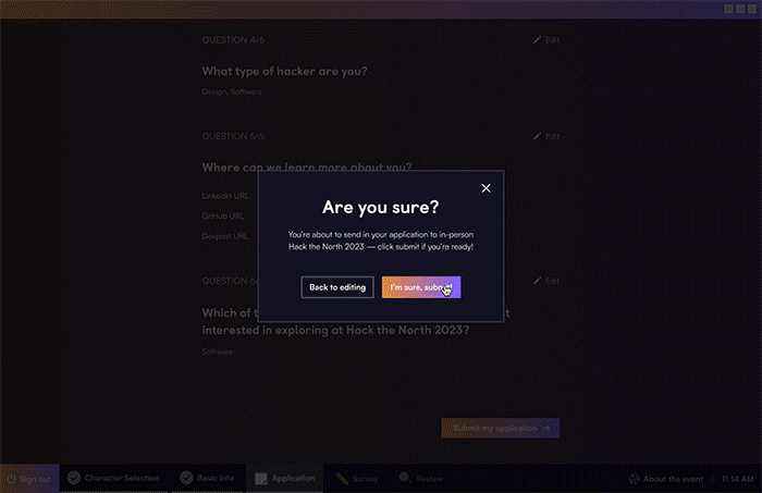
The outro screen doesn't consist of a lot of dynamic elements, so I added a little flare and asked frontend to make the neon signs slowly dim and turn back on.
Now,
You can use a random/fake email address to create an account
07 — Takeaways & Thoughts
The launch was a huge success with over 9,000 applications created and over 6,000 applications submitted!
What I learned
Consistency is key
As someone who's very keen on UI design, I really liked this project - it felt like a nice UI challenge. From bridging all the themes together and creating new components that could tie in the different sections we have in the application, I learned how to design with consistency at the front of my mind.
Working under time pressure
Given 2 weeks to finish the project from ideation to hand-off, I had to work multiple hours a day to pull everything off. Although I felt stuck at times, I could not thank my design team enough for all the support and feedback they were able to provide throughout the project! I couldn't have done it without them.
Collaborating with other teams
Working cross-functionally is something I always find to be challenging but fun and fulfilling at the end. From working with the application squad to make sure we're aligned on the content and see if there are any questions we could bring visual attention to such as haiku, to working with frontend and backend to make sure everything's technically feasible, it took a lot of discussions and meetings! I'm happy everyone was able to bring in their perspectives and insights to make this project come to fruition and have a successful launch.
